Saturday, August 9, 2014

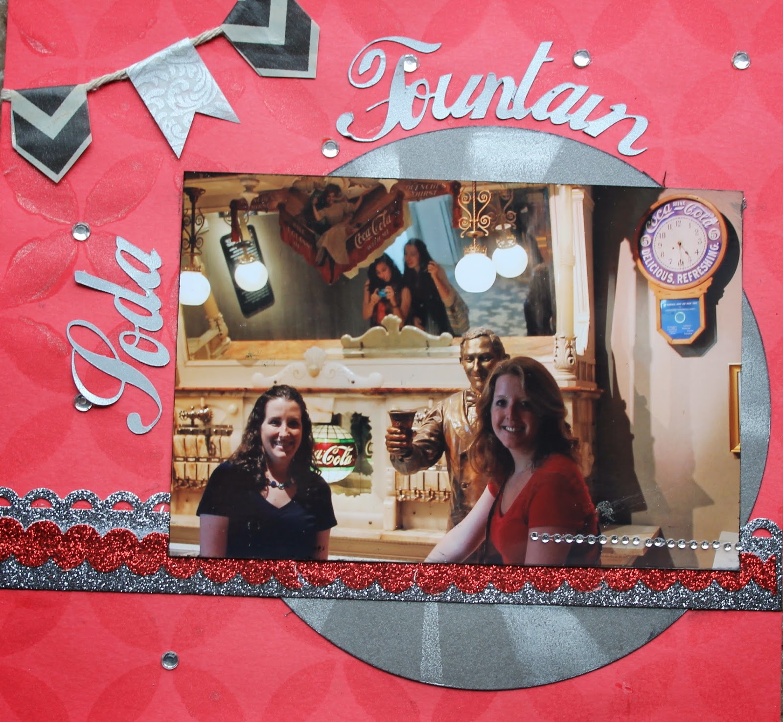
Soda Fountain

 This page from Coke World is a classic. You have to walk through the old fashioned soda counter. As I blog this I realize how much I need to practice taking straighter pictures. I don't feel like I have that crooked of embellishments on the page. I used the same repetitive supplies throughout this album. Granted I did a lot of this album at a hotel crop, so didn't pack the whole room.

 I have taken a liking to the Channel font o my Silhouette. I like that it is thin enough to curve around things.
 
One of my favorite parts is how I did the sunburst on the circle embellishment. I like the two tone effect of the grey on silver. 

I'm so excited that I got a picture in the mirror. It was fun and a cool effect with my camera. I realized what a difference the few steps over does to the lightening. I really enjoy these pocket pages, and the small part is just perfect for my journalling.

Saturday, August 2, 2014

Cultures of Coke World

 As a member of a bilingual and bicultural community I always enjoy the culture of new places and new experiences. One of the things I enjoyed about Coke World was their variety of memorabilia from around the world. Of course I could only read the Spanish, but it was still cool.

 This page was really fun and tough to make. I didn't like any of my supplies and I was getting sick and tired of working with red. So I started painting with my Distress Paints on some kraft paper. The big bottle on the right was my inspiration for the page. Then I decided to paint on the burlap piece as well. I incorporated some ink into the page as well. Unfortunately my dirty fingers got in the way and on the page. I ruched up some ribbon as well.

This second page I really like. My second language is Spanish so this was really cool to me. I enjoyed using the pocket protectors in this album to speed it up. With the demands of life and work and continuing education, scrapping doesn't happen too regularly. I feel like I've been working on this album forever.


I pulled out my favorite mask and mist to jazz up the red paper along with letters cut on my Silhouette.

Saturday, July 26, 2014

Rehersal Dinner

 This is one of my favorite page from my Atlanta album. I may or may not have thrown out like 6 pages of navy blue paper in the process of figuring out what I was doing. But now I'm out of my nice heavy navy cardstock.

I pulled out my favorite Hero Arts background stamp along with embossing powder and watermark ink. But the texture of the paper made this even better.

 One of my favorite things on this page are the embellishments. I used a pack of banners from Heidi Swapp and some Prima flowers. My goal on this page was elegance.

 I cut the font on my Silhouette using the Channel font. It was very delicate to work with and I had to be extremely careful putting it down. But I achieved my goal for the page.


Saturday, July 19, 2014

Beautiful flowers

 One of my favorite parts of my big camera is the ability to take photos up close of gorgeous subjects. I just don't feel like I have that ability with the phone. I am a sucker when it comes to flower pictures. I can't get enough of them. I did a collage on Picasa and then printed a few collages in 4x6 format to make this page.

 I used my Close to my Heart Chevron stamps in the corner, and then used some bling in the middle to close the big gaps. I like all the patterns within the chevrons. I'm not a big fan of buying brand new stamps, but I'm a sucker for chevrons.

Saturday, July 12, 2014

Fall Decorations at the Gardens


When we visited Atlanta it was early in October. We were surprised with temperatures closer to our normal highs in June but with pumpkins and changing trees. The garden was in the process of setting up for both their Halloween and Christmas displays. We normally get up to Door County this time of year, so we were happy to get our fall fix.

I had a lot of fun making this page. I used my favorite mask and mist to color the back ground. I used a combo of paper from American Crafts and Imaginesnce. I also used burlap flowers from Little Yellow Bicycle. I didn't want to have the brown burlap color so I used my Tim Holtz Distress Paint. I learned my lesson to let it dry on it's own or else it will stink if you try and dry it.

 I also used some cork arrows from Studio Calico and some ribbon from American Crafts to jazz up this page!

Saturday, July 5, 2014

A Few More

 I have a few more pages from the garden to share. Sometimes I take more pictures of my actual pages than others. For some reason the Orchid Garden only got the main picture and nothing else, but I really wanted to share it. I think Orchids are a beautiful flower and this was a great page. 

 The background paper was from Close to my Heart. The stickers are from Thickers and they are the perfect color. I also brought in some Basic Grey chipboard that I've used throughout this album. The ribbon was something random I found laying around and folder over and cut to make as part of my title.

The second page I am sharing is of the skyline. I didn't do titles on all my pages as some are more obvious. This was a really different but fun page for me to try.

 My favorite part is the mixed media bottom with the skyscrapers. My friend Rita has this stencil and I had to borrow it to go with this page. I used some Ferro Paste from Viva. It is a very fun and gritty paste to work with, but has the perfect effect for this page. The only thing I realized is how fast you much wash it off, as it dries fast and is a bit gritty.


Throughout this page I used some other embellishments including washi tape and wood veneers. I changed the colors of the veneers using my Tim Holtz Distress Ink.
Saturday, June 28, 2014

Tropical Domes

While at the Botanical Gardens we visited the Tropical Domes. My inner teacher takes in all of the information I learn at these places. I'm doing this book in an 8x8 format which is why I have so many of one activity. I was stir crazy all weekend without my laptop, as I wanted to load all my pictures. It was really tough traveling with only my iPad and not having the ability to see my pictures on a full screen.

 My techniques are getting a little repetitive in this book. But I wanted the pages to flow together nicely and smoothly. I used watermark ink and mist on the background of the page. The green paper was ran through my cuttlebug and then sanded to reveal the second core color underneath.

 I combined a few different embellishments on this page. I used a combo of Basic Grey Chipboard along with Prima and Imaginensce flowers in this cluster.

I didn't journal on every single page but I did on some. Some of my journalling were in the pocket protectors and some were right on the page. I really wanted to capture the details of the vacation in one way or another.